
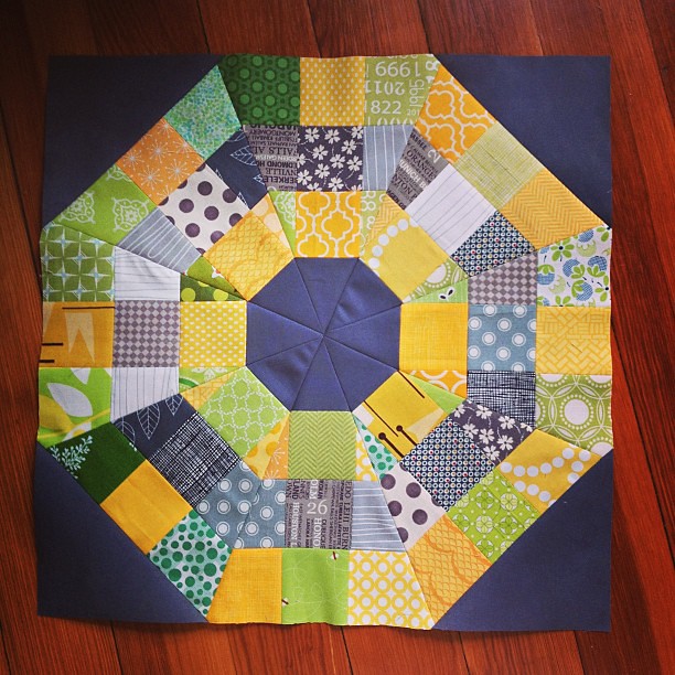
I finished this block this morning, using a tutorial by Elizabeth Hartman. It is for Leanne, who so graciously offered to make a charity quilt this month with our Always Bee Learning blocks. It was a fun block to make, and I think it looks more difficult than it really is. And isn't that the best kind?
Since I didn't take any pictures of the process while I was making my Baby Steps quilt, I thought I should make another one so I could have some visual aid for the tutorial. Only, I put the blocks up on my design wall and I completely hate it.

When I started it, I thought it would be really cute with the Les Amis prints and a soft yellow solid. But it looks awful. What do you think? How to salvage it? I'm definitely going to take out the browns. The scrappy blocks seem a little distracting, too. Maybe I should just stick with one color per zig? Who knows. I have a feeling these blocks may just end up in the scrap pile
Soccer starts on Tuesday so I was really hoping to get the tutorial done before then since I'm not sure how much sewing I will accomplish once sports and farming start back.
Your octagonal lock is lovely. The grey and yellow is a nice combo
ReplyDeleteI don't find the pieces of the Les Amis distracting. I do think I'd trade out the yellow for something else, maybe even a Kona white or a coal. (I find yellow really hard to play with as an accent.)
ReplyDeleteI think you kind of lose the zigs when they're scrappy. I think you're right--one color per zig might be best!
ReplyDeleteLove the block for Leanne.
ReplyDeleteI don't think the quilt looks too bad, the wallpaper doesn't help - does it look shocking outside?
Your block is lovely! I'm sorry about your tutorial blocks... I have no useful suggestions, though. :}
ReplyDeleteThe block is fabulous. I don't know what you're talking about... the quilt looks great!! I really like the scrappy blocks and the prints are gorgeous. Ok maybe the yellow wasn't the best choice - darker might have worked better - here's what I'd do: Since I hate unpicking and wouldn't have time, I would quilt it with a really nice dark teal or grey inside the yellow following the zig zags. If you can be bothered unpicking I would make the zig zags darker.
ReplyDeleteAlso agree with Hadley about the wallpaper ;)
Your orb block is beautiful! And maybe the quilt is too scrappy - the zig zags in the one colour in your original quilt looked lovely.
ReplyDeleteThe block is fab. I'm not so fond of the quilt colours, sorry! I think it's the brown and grey that don't belong
ReplyDeleteI love that bee block!
ReplyDeleteI made my second quilt from an Elizabeth Hartmann tutorial -- the Modern Block Sampler.
ReplyDeleteLove the bee block!
ReplyDeleteThe bee block for Leanne is gorgeous - I agree with Hadley and actually take out the brown and you'll be there I think :)
ReplyDeleteI think the quilt is totally salvageable. Les Amis is so fab. I agree the brown is out of place and I also agree that the scrappy blocks are distracting. Whether to go with the zags all in one colour or to keep it scrappy...I think either will be great. I do think that the yellow might not be the best choice - perhaps a gray like charcoal or coal as someone else suggested?
ReplyDeleteLove your orb bigtime!
ReplyDelete